
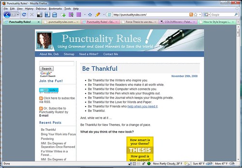
Just for comparison’s sake.
The old design (click for bigger):
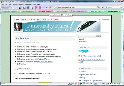
The new design. (Well, obviously, this is what you’re LOOKING at, but I figure this makes for good record-keeping for any future changes I might make, so…)
A friend and I were just chatting about how much more “open” the new design feels, but I find it hard to pinpoint WHY. Sure, the background color is lighter, and the Navbar/Tabs are light gray instead of blue, but otherwise, it looks awfully similar, just with the sidebar on the right … And yet, it FEELS so much more open.
Why do you suppose that is?
The 1/4″ of white space around the header makes it appear to float, and the dark band below it is gone. Everything looks lighter as a result.
Debra Dalgleish’s last blog post..Excel Twitters 20081129
Also, the foreground area is bigger, with the same amount of stuff in it. So, it is more open.
Judy H.’s last blog post..Newbies!
True. The horizontal width IS bigger, and white space is not a bad thing.
That reminds me, though … I should reformat my header image so it’s the same width as the page …
Love the new look, Deb, though the change is subtle.
Lillie Ammann’s last blog post..Blog Book Tour This Week
Much better! Well done.
Brad Shorr’s last blog post..Interruption Marketing that Works!
I definitely like the sidebar over on the right. Not sure why, but it feels more natural there. Looking good!
Melissa Donovan’s last blog post..How to Write a Novel
I think more and more sites are doing right-sided sidebars, so we’re getting more used to SEEING them, so that anything else just doesn’t look right anymore. (Because, well, duh, it’s on the LEFT.)
Your eye is trained to scan left-to-right. The lefthand sidebars tend to interrupt the scanning. With the shifting of the sidebar to the right, teh eye glides more easily over the text. Or at least that’s what I remember from my old Sensation & Perception class that I TAed
It’s also important to have content on left and sidebars on right if you have mobile users, for pages are seen vertically, so if sidebars are on left, one has to scroll through all of it.
JC and Ari–good points. Especially about the mobile users–something I usually forget about since my cell phone doesn’t DO internet browsing. (I really need to change that one of these days.)
Chiming in rather late–I think it could be the light color in the foreground and background, with the noticeably darker color between. It adds a certain crispness. Plus, having the tabs above the banner, rather than below it, and especially having the tabs no longer darker than the banner, gives a feeling of openness as well.