In the space of just a few days, I got three different magazine subscription offers, boom, boom, boom, and thought I’d share my thoughts.
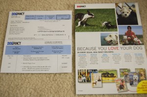
First, this short-and-sweet offer from Dog Fancy. The main piece is what I think of as a “two-thirds” mailing, because instead of being 11″ long like a standard sheet of paper, it’s roughly two-thirds of, that, and simply folded in half along the perforation. The top half is the reply form and the bottom half is the “Summary of Benefits.” Though, the proportion for that seems all wrong–it looks like it was actually cut off, as if there should be a bottom third.
The only insert is a two-sided, color piece that gives quotes from readers on one side and a list of what the magazine offers on the other–all liberally decorated by pictures of cute dogs.
Personally, if it were up to me, I would have made the actual reply piece the one that was more colorful and eye-catching–that piece, the one people have to look at to actually subscribe is where the action is. The insert is nice, but my feeling is that you shouldn’t waste your color and extra-eye-catching design on the piece that’s going in the garbage later on–if it’s looked at all.
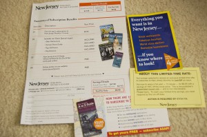
Second, a piece from New Jersey Monthly. This comes on a full-size sheet of paper with color illustrations of the magazine. The top two-thirds are the subscription offer, with the bottom third being the return-coupon. This means that, reading the piece, your eye ends at the spot where you take action–“Detach here and mail. Keep top portion for your records.” (Though, since that is ON the top portion, it makes it sound as if you’re detaching the top and mailing it back, but that’s really just quibbling.)
This offer came with not one, but three inserts–all the small, buck-slip size. A yellow paper telling me this is a limited-time offer. A glossy slip telling me about the special “A-to-Z Guide” that’s a premium for subscribing. Third, a little, glossy booklet with the fantastic headline, “Everything you want is in New Jersey … if you know where to look!” (I particularly liked how the font changed on the state name so that it matched the logo of the magazine. And I love the slogan–New Jersey gets too bad a rap, you know? )
If only because of the variety of inserts and the full-size of the main piece, I liked this mailing a little better. There was enough space for them to sell the magazine, and it didn’t leave me turning the page over looking for the rest of the “benefits.”
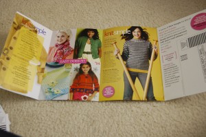
Third, this Knit Simple offer, which kind of blew the other two out of the water.
Firstly, it’s different. The offer IS the mailing piece. It’s not a piece of paper that was inserted into an envelope. Instead, it’s a fold-out, cardstock presentation. Two sides, four panels, lots of color, lots of pictures. Very eye-catching. It has a substantial feel in the hand, and it’s refreshing not to have lots of little extra pieces to lose or drop on the floor.
Not only that, it kind of looks like a magazine–it gives you a feel for the look of the magazine, full of color and knitted pieces, and since it’s all one piece, you actually look at all of it. The reply portion is a business-reply card ready to be detached from the innermost fold of the mailing. No envelopes to lose. Nothing fussy.
Of course, the caveat is that this kind of piece is going to be a lot more expensive to produce than something printed on a standard laser printer and stuffed in a standard envelope, but … it sure did catch my eye. And isn’t that the point?


